Jellybean mistakes 2: Barplots
Let’s dig into the problem of barplots and where to use them, but most importantly where to avoid them. First look into the anscombe data to understand what is the problem with hiding the actual points and showing only a few ambiguous descriptive values about the dataset.
The problem with Anscombe’s quartet
Let’s start with putting the data in a more tidy shape.
ansc_tidy <- anscombe %>%
  gather(axis, value) %>%
  separate(axis, c("axis", "group"), 1)
Our data consist of four independent measurments (group) which each consist of 2 connected points, x and y (axis). Now let’s see what we have with a barplot and error bars showing the standard deviations.
ansc_tidy %>%
  ggplot(aes(x = group, y = value, fill = axis, color = axis)) +
  stat_summary(fun.y = "mean", geom = "bar", position = "dodge", alpha = 0.2) +
  stat_summary(geom = "errorbar", fun.data = mean_se, position = position_dodge(0.9), width = 0.2)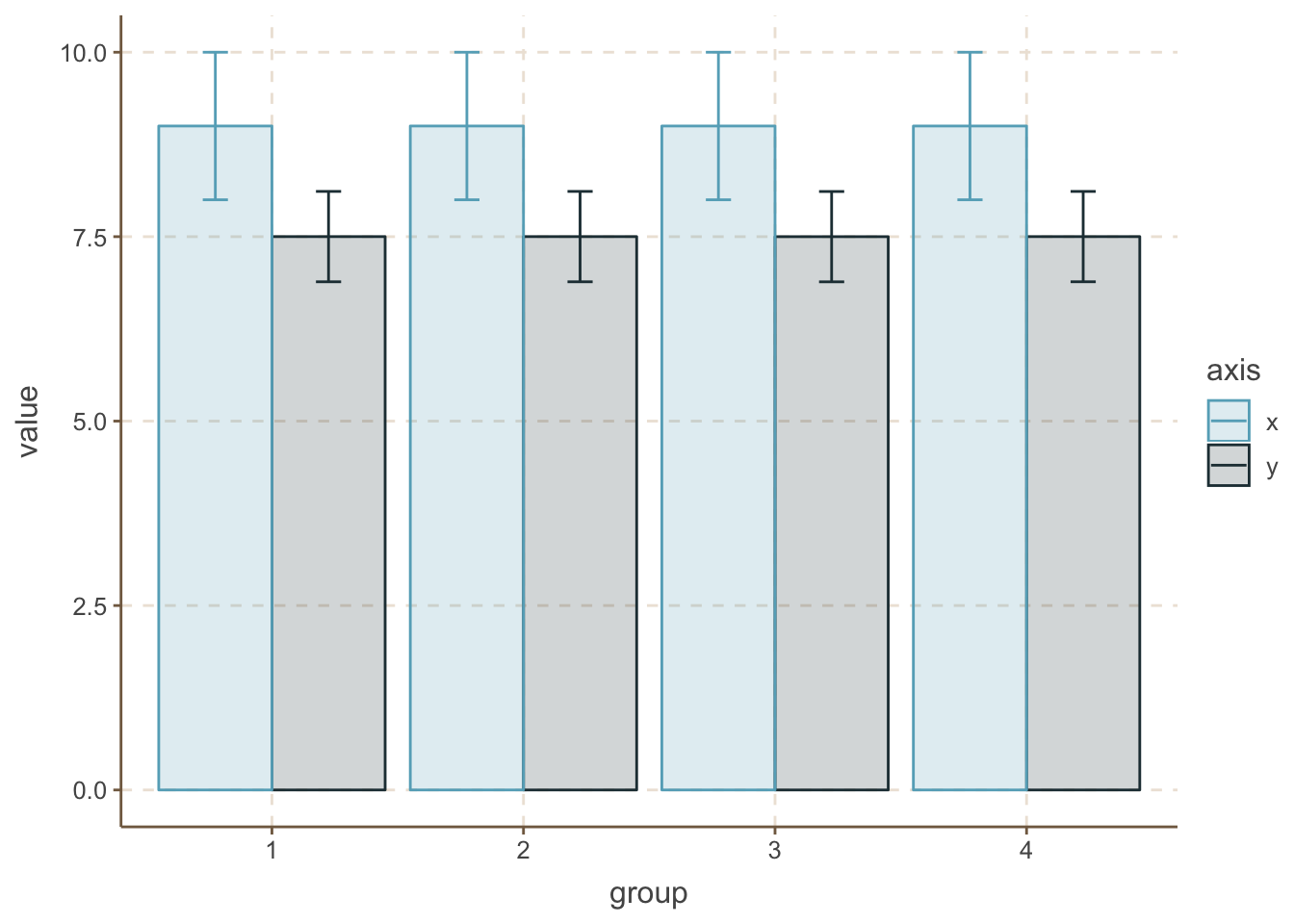
That’s interesting, all 4 groups look identical for both x and y values in the case of mean and SD. But are they really that similar? Keep the barplots and put some jittered dot with the actual data on them.
ansc_tidy %>%
  ggplot(aes(x = group, y = value, fill = axis, color = axis)) +
  stat_summary(fun.y = "mean", geom = "bar", position = "dodge", alpha = 0.2) +
  stat_summary(geom = "errorbar", fun.data = mean_se, position = position_dodge(0.9), width = 0.2) +
  geom_point(position = position_jitterdodge(jitter.width = 0.2, jitter.height = 0, dodge.width = 0.8))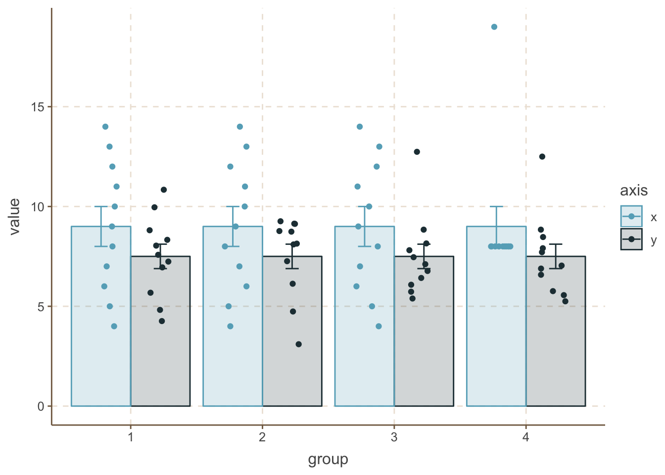
Now we can see some striking differences. The first and most strongest maybe is the 4th group’s x data, where the ponts are identical except one extreme value. As for the y data, you can see some more compressed data in the 2nd group and some outliers in the 3rd and 4th case.
Better representation of data
The next question would be, if we cannot trust barplots with errorbars, what representation we should use. One better step is presented above, when you keep the barplots with error bars and plot the actual data on top of it.
Boxplots
Maybe one of the best choice could be boxplots. There you plot much more descriptive values which are also less sensitive to outliers (mean vs median).
ansc_tidy %>%
  ggplot(aes(x = group, y = value, fill = axis, color = axis)) +
  geom_boxplot(alpha = 0.2)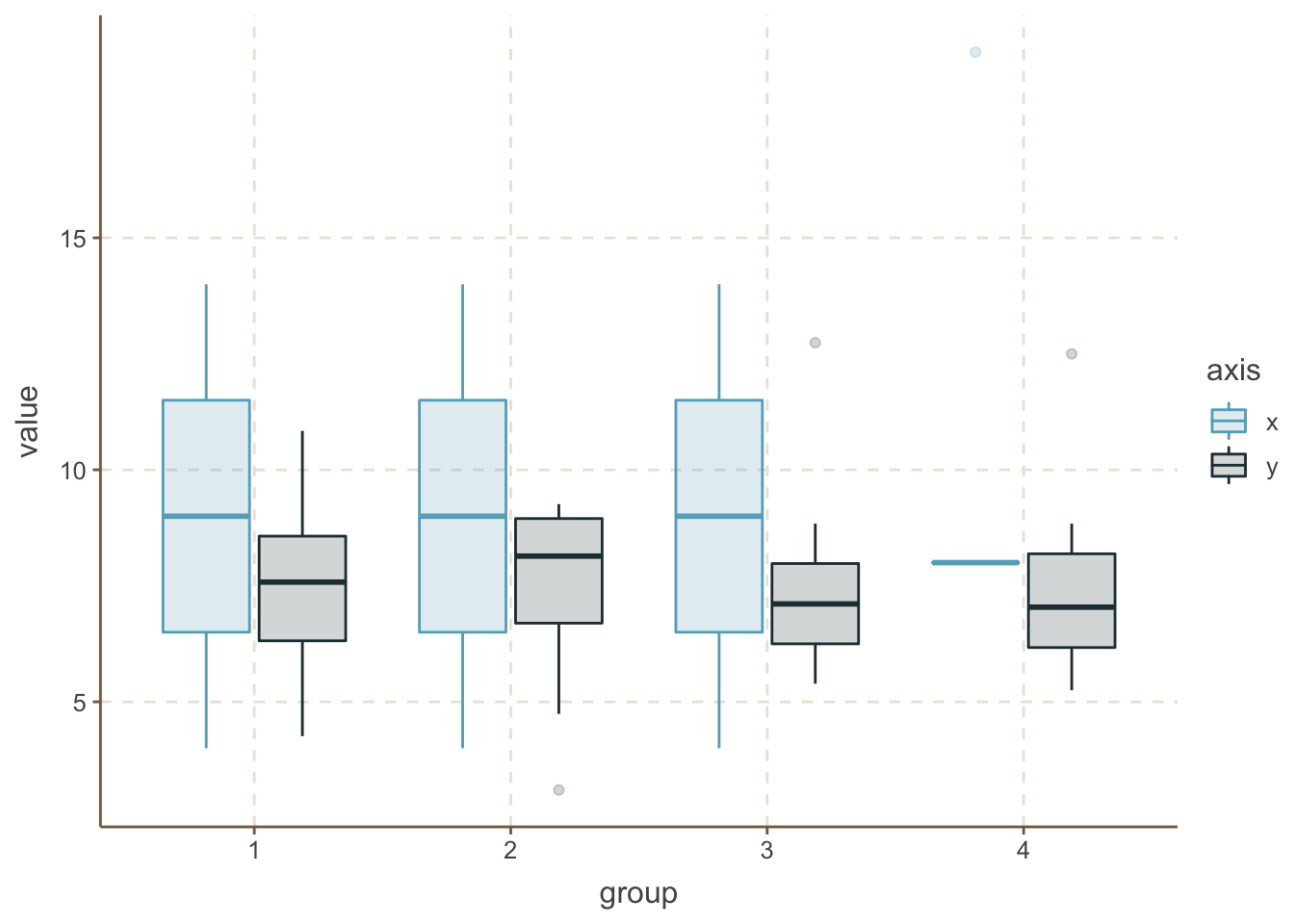
One extra step can be if you add the raw data points here too.
ansc_tidy %>%
  ggplot(aes(x = group, y = value, fill = axis, color = axis)) +
  geom_boxplot(alpha = 0.2) +
  geom_point(position = position_jitterdodge(jitter.width = 0.1, jitter.height = 0, dodge.width = 0.8))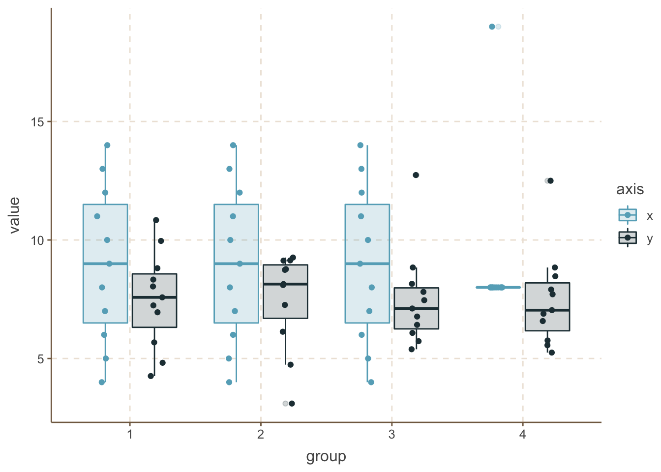
There is plenty of other solutions, like violin plots, but the concept is the same. Showing more information about your data, including more descriptive values and in optimal case the actual values can be much more beneficial for you and especially for the audience to explain, understand and explore your data.
Also several other features were not discussed barplots+eroor bars can hide, for example sample size and confidence intervals.
Don’t leave barplots
If we cannot use barplots for such kind of population data without compromising the understanding, then where we can use barplots? Don’t worry, they have their own place.
You can use barplots if you have count data, ratios or percentages. In this case, there will be no error bars.
Let’s see a survival data, where we had 5 conditions, each with a starting population size inbetween 230 and 300. Then let’s generate the survived individuals between 20-80%. Add an extra twist, and select 10-90% of the survived ones as “positive” (for disease or transformation).
data <- tibble(group = 1:5,
               population = sample(230:300, 5)) %>%
  mutate(survived = round(population * sample(20:80, 5) / 100),
         positive = round(survived * sample(10:90, 5) / 100)) %>%
  mutate(negative = survived - positive,
         dead = population - survived) %>%
  select(group, dead, negative, positive) %>%
  gather(condition, number, -group)

data
## # A tibble: 15 x 3
## group condition number
## <int> <chr> <dbl>
## 1 1 dead 118
## 2 2 dead 129
## 3 3 dead 119
## 4 4 dead 96
## 5 5 dead 89
## 6 1 negative 63
## 7 2 negative 87
## 8 3 negative 17
## 9 4 negative 106
## 10 5 negative 47
## 11 1 positive 70
## 12 2 positive 36
## 13 3 positive 141
## 14 4 positive 57
## 15 5 positive 127data %>%
ggplot(aes(x = group, y = number, fill = condition, label = number)) +
geom_bar(stat = "identity", alpha = 0.8, position = "fill") +
geom_text(position = position_fill(vjust = .5)) +
labs(title = "Survival rate", x = "Group", y = "Ratio of individuals")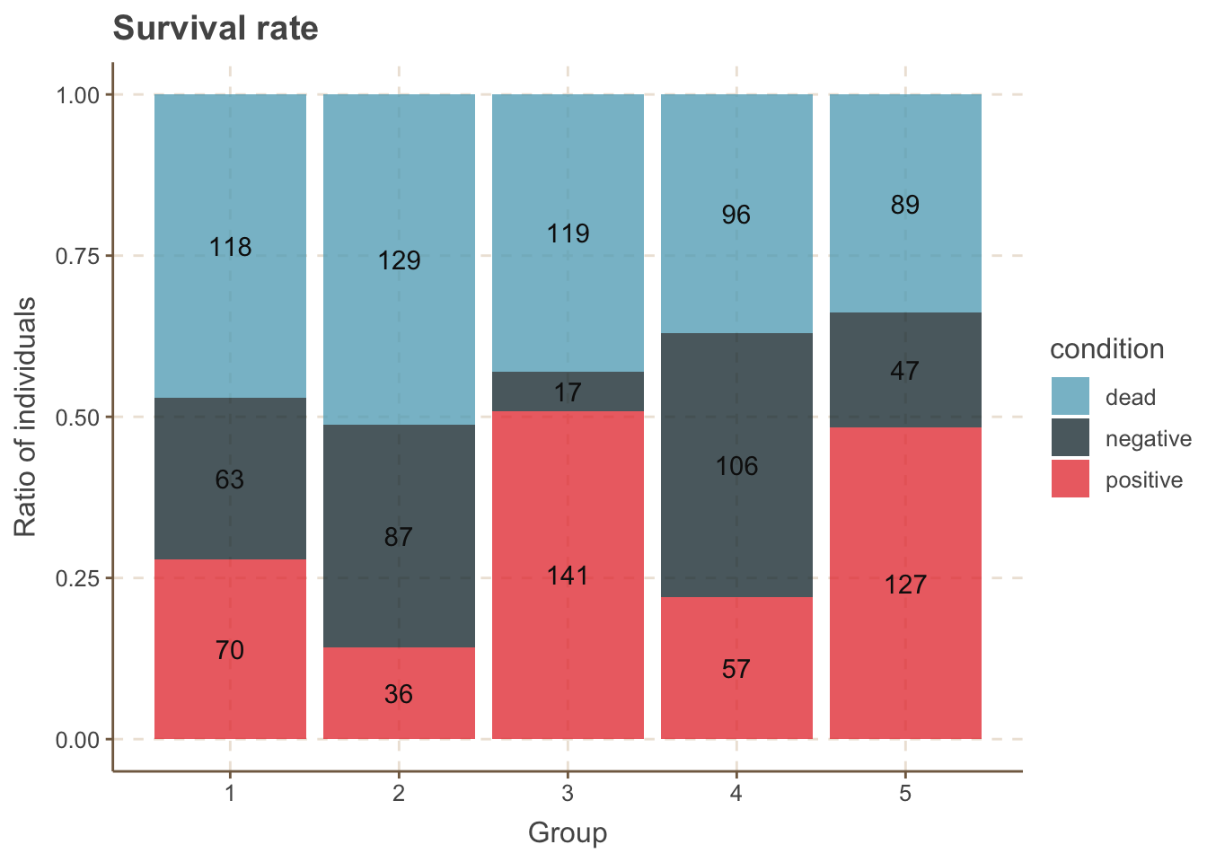
The best way to use barplots
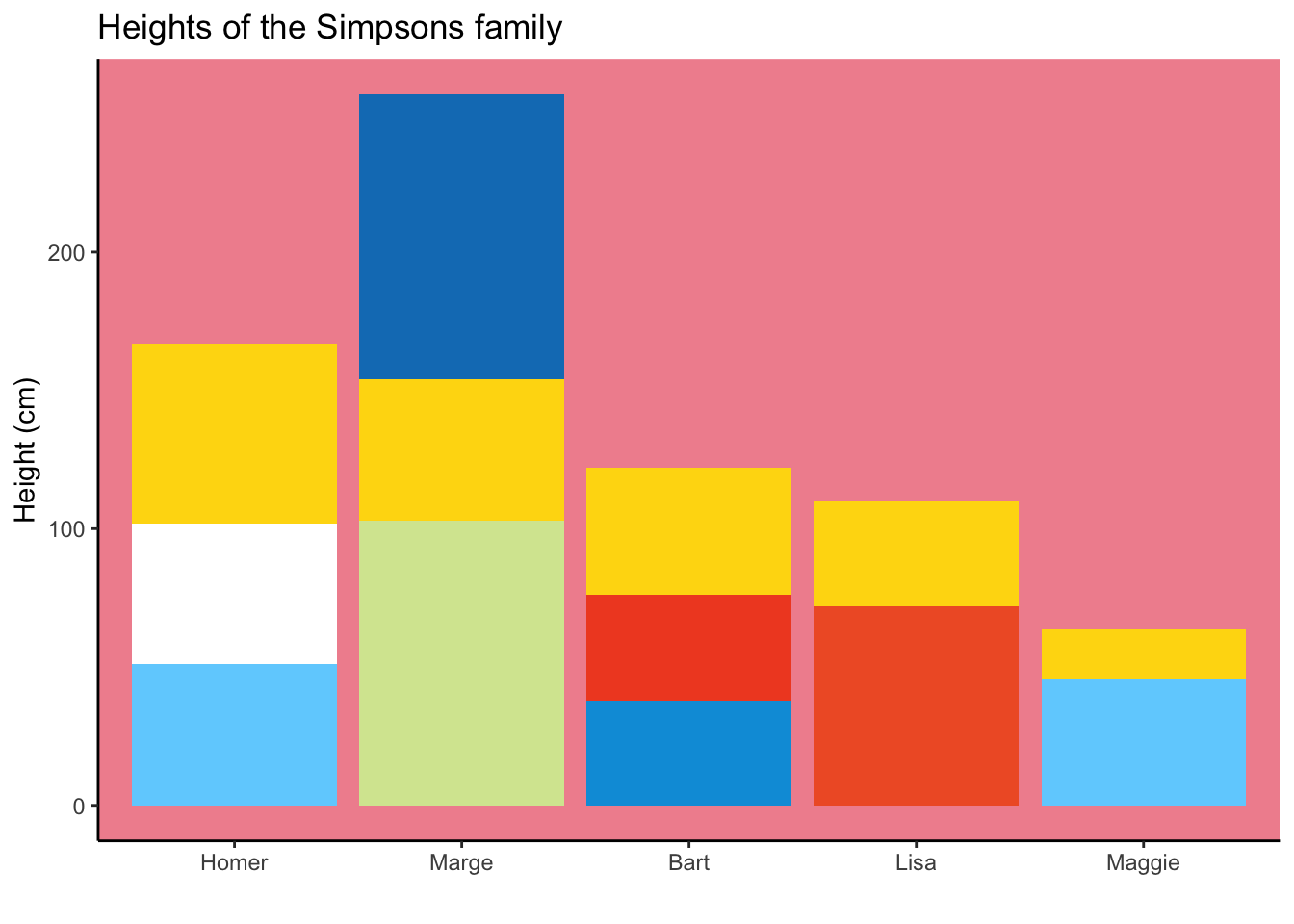
A similar problem, when we would like to plot exact values, for example heights of Simpson characters. In my opinion, this is the best usage so far. - Modified after this post.
simpsons <- tribble(
  ~member, ~part, ~height,
  "Homer", "homer_pants", 51,
  "Homer", "homer_shirt", 51,
  "Homer", "skin", 65,
  "Marge", "marge_dress", 103,
  "Marge", "skin", 51,
  "Marge", "marge_hair", 103,
  "Bart", "bart_shorts", 38,
  "Bart", "bart_shirt", 38,
  "Bart", "skin", 46,
  "Lisa", "lisa_dress", 72,
  "Lisa", "skin", 38,
  "Maggie", "onesie", 46,
  "Maggie", "skin", 18
) %>%
  mutate(member = member %>% fct_relevel(c("Homer","Marge","Bart","Lisa","Maggie")),
         part = part %>% fct_relevel(c("marge_hair","skin", "homer_pants","homer_shirt",
                     "marge_dress",
                     "bart_shirt", "bart_shorts",
                     "lisa_dress",
                     "onesie")))


ggplot(data = simpsons, mapping = aes(x=member, y=height, fill=part)) +
   geom_bar(stat="identity", show.legend = FALSE) +
   scale_fill_manual(values=c("#107DC0","#FED90F","#FFFFFF", "#70D1FE", "#D6E69F",  "#F14E28","#009DDC", "#F05E2F", "#70D1FE")) +
    theme_classic() +
  theme(panel.background = element_rect(fill = "#f1919d")) +
  labs(title = "Heights of the Simpsons family", x = "", y = "Height (cm)")